What is the 2023 Pantone colour of the year?
Every year the folks over at Pantone announce their colour of the year, with their choice often proving influential across various industries ranging from interior design, fashion, graphic design and branding. A lot of thought goes into choosing the Pantone colour of the year, with their expert team analysing global trends across a variety of sources from artists, designers, movies and even popular travel destinations and politics!
The Pantone colour of the year can be particularly inspiring for new companies trying to establish their brand colours and existing companies undergoing a rebranding process, in both of these circumstances we highly recommend utilising Pantone matched promotional merchandise to bolster and promote your brand. If you are creating a new brand or undergoing a rebranding process but haven’t yet chosen your brand colours, read on for some colourful inspiration where we’ve listed the previous Pantone colours of the year for the past decade, reveal what 2023s Pantone colour of year is and touch upon the importance of the psychology of colour.
What were Pantone’s previous colours of the year?
Pantone have been naming their colour of the year since 2000, with each being unique and distinctive. The colour is chosen by a group of experts at the The Pantone Color Institute. Their choice of Pantone colour of the year influences many design trends throughout lots of industries.
But, before we show you some very cool examples of that, check out some past colours of the year choices below…

What was Pantone’s colour of the year for 2022?
Pantone’s colour of the year for 2022 was PANTONE 17-3938 Very Peri. Like with all of Pantone’s choices, there is lots of theory behind this colour choice. Pantone believe the colour defines the mood of the globe as we transition into the post Covid way of life. They describe it as a colour with a “carefree confidence” and see a creative spirit in the colour.

Finally (DRUMROLL)….What was Pantone’s colour of the year for 2023?
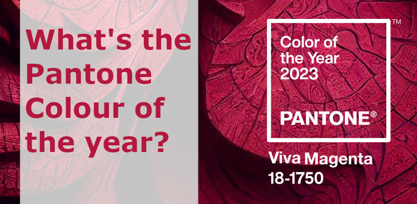
Pantone’s colour of the year for 2023 is PANTONE 18-1750 Viva Magenta. Welcome to the Magentaverse, at least according to Pantone.
Viva Magenta is a colour full of life, a shade rooted in nature but with ties to the red family, it offers strength and vigor. Pantone describes the colour as joyful, powerful and empowering. It seems it’s been a very popular colour choice and its claimed links to the natural world shine through beautifully in these stunning pictures on Travel & Leisure’s website.

Why does Pantone’s colour of the year matter?
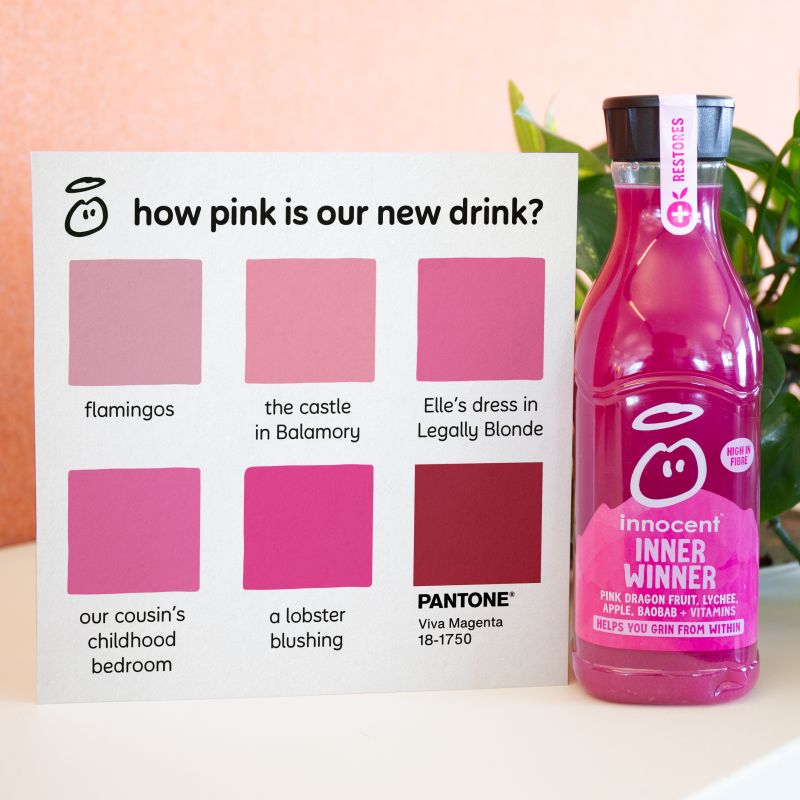
Well, it influences design trends throughout the world, in lots of different industries. This article from Affordable ArtFair highlights the use of Magenta in art and interior design and the effects in can have on us. While below, you can see that our friends at Innocent Drinks (who really understand the importance of branding and colour!) have a new juice inspired by the Pantone colour of the year. We can’t wait to try it!

Can a colour really do all that?
We will let you make up your mind as to how 2023’s colour of the year resonates with you but we love the vibrancy of this years colour choice. Especially as it’s very close to Brandelity’s own magenta colour in our logo.
Whilst our experiences of colour is in part individual, there is theory and research behind how colours make us think, feel and the emotions we associate with them. For example, the colour green is often used to promote environmental or eco-friendly products with the colour being associated with nature and positivity. Colour is particularly important to brands and is used to portray their desired image to an audience. For example Coca Cola, which was founded in 1892, uses red to keep their brand looking fresh and bold. Considerably younger brands such as Netflix or Youtube also utilise red. We think Viva Magenta envokes a feeling of empowerment and a sophisticated and confident enthusiam for life. We can’t wait to see where else Pantone’s colour of the year pops up in 2023.
Why not Pantone match your merchandise?
With colour being so important to brands, it’s important to reflect your brand colours fully across all of your marketing and promotions, including that of any branded merchandise you choose. The benefits of Pantone matching your merchandise includes:
- Pantone matched merchandise ensures your promotional products fully represent your brand whilst ensuring brand consistency.
- Colour matched merchandise instantly identifies an item of merchandise with your brand which helps aid brand recognition/brand recall when consumers have repeated exposure.
- The vast majority of branded merchandise uses stock colours. Whilst this isn’t a bad thing, by choosing Pantone matched merchandise it really distinguishes your merchandise from other promotional items your clients receive.
- With Pantone matched merchandise often being more distinguishable from other items of merchandise it carries with it a perceived higher value, which increases brand value.
We’ve a variety of promotional products that can be Pantone matched to your brand colours ranging from brollies to drink bottles. In addition to being Pantone matched, all of our items come printed with your logo. A selection of the merchandise we can Pantone match to your brands colours can be seen below, to view our full offering click the button below.
Share This Page
Narelle McGregor
Marketing Manager at Brandelity. Passionate lead generator, content creator and digital marketer with more than 12 years experience. Works hard daily to promote sustainable branded merchandise and highlight the impact of eco-friendly promotional products.


